← Back to portfolioTABLEAU · MARKET ANALYSIS · DATA STORYTELLINGWashington EV
Market Overview
An interactive executive dashboard designed to make Washington State electric-vehicle registration data understandable, explorable, and useful.
THE QUESTIONHow is electric-vehicle adoption changing across Washington’s counties, manufacturers, vehicle types, and model years?
THE APPROACHStructure the analysis around a clear KPI hierarchy, responsive filters, geographic context, market share, and explicit data-quality controls.
THE RESULTA decision-ready view that makes regional differences, adoption patterns, and market leaders visible without overwhelming the user.
KEY FINDINGS
What the evidence tells us.
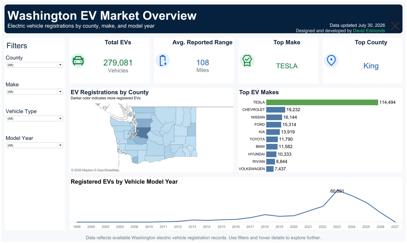
Published snapshot labeled July 30, 2026 · all filters cleared. The live dashboard may change; these findings refer to the linked image.
114,494 TeslasOne make leads the snapshot
Tesla represents about 41.0% of the 279,081 vehicles shown in the published, unfiltered dashboard snapshot.
Decision to informExplore manufacturer concentration by county and vehicle type before applying a statewide pattern locally.
July 30, 2026 dashboard snapshot ↗King CountyVolume is geographically concentrated
King is the top county by registered EV count in the snapshot. The map displays counts, rather than population-adjusted adoption rates.
Decision to informUse counts for scale; add population or total-vehicle denominators before comparing adoption penetration.
County map and top-county KPI ↗60,091 · MY2023Model year describes fleet composition
Model year 2023 has the largest cohort in the snapshot, at 60,091 vehicles. These are model years of registered vehicles, not registration dates.
Decision to informDo not interpret the lower counts for newer model years as a measured decline in annual registrations.
Model-year distribution ↗ INTERACTIVE DASHBOARD
Explore the data.
Use the Tableau controls to filter by county, make, model year, and vehicle type. For the best small-screen experience, open the dashboard directly in Tableau.
DESIGN DECISIONS
Built for clarity,
not decoration.
Lead with the market
Top-level KPIs answer the first questions quickly before the user moves into detailed exploration.
Make filters purposeful
Controls align with meaningful business dimensions rather than exposing every available field.
Protect interpretation
Data-quality checks and clear labels reduce the risk of drawing conclusions from incomplete or inconsistent values.